

Packaging Design
First impressions happen in seconds, and your packaging is your brand’s silent ambassador. From luxury boxes to eco-friendly pouches, I create strategic designs that balance beauty with function—whether for a single flagship item or a full product family.
R3 by Rie Miura’s Eyelash Products Range Packaging
Full Family Range Boxes Design
Packaging Design // Box Design // Packaging Kit
Client
Rie Miura
The design concept for the R3's eyelash product range I created is a mixed of Graphic Modernism and Avant-garde street style. The core elements—overlapping concentric circles, dotted textures, and sharp geometric overlays—act as a visual metaphor for focus and vision, drawing the eye directly to the craftsmanship of the lashes themselves. I aimed for the feel of playful, bold, sleek, clean yet sophisticated.
Geometric Narrative
Concentric Rings: The thin, white-lined circles mimic the ripple of a drop or the architecture of an iris. They create a sense of motion and focus, leading the consumer’s eye toward the center of the box.
Halftone Dotted Patterns: These patterns provide a textural bridge between solid blocks of color. They lend a "pop-art" or "high-tech" feel, suggesting that the lashes are precision-engineered.
Color Blocking: The use of diagonal and semi-circle blocks on the side panels ensures that the packaging looks dynamic from any angle, whether stacked on a shelf or held in the hand.
Thoughtful's Ready Meal
Packaging Sleeve Design
Packaging Design // Sleeve Design
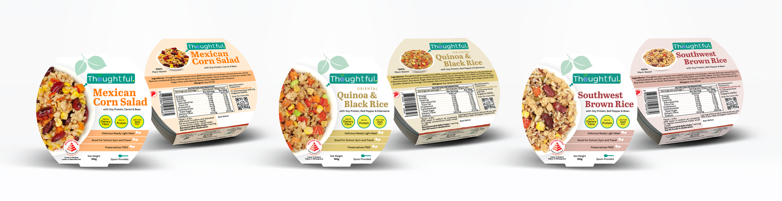
Balanced Whitespace: In contrast to the information-rich top panel, I embrace the side panel with clean and open whitespace. This breathing room elevates the product’s premium feel, preventing shelf clutter while ensuring the core message remains highly legible. A consumer walking down the aisle can instantly identify the brand and variant within seconds.
For the instructional panel, I am using monoline graphic icon style in clean and uniform line weights form, paired with playful colors to ensure clarity on food safety, preparation and product preservation.
This packaging sleeve design reimagines ready-to-eat meals through a lens of modern minimalism, health transparency, and organic freshness. Designed for the urban, health-conscious consumer, the packaging balances appetizing visual appeal with structured, easy-to-digest nutritional information.
Showcasing a dynamic, high-resolution macro photograph of the meal. This half-circle framing acts as the primary key visual, offering consumers an honest, mouth-watering look at the actual ingredients, followed by the banding identity and product naming aligned to the right, the design establishes a strong reading gravity that flows naturally from brand recognition to product details.
Client
Thoughtful Food
Herbal Tea Drink
Label Design
Packaging Label Design
Packaging Design // Label Design
I designed the label artwork by mixing traditional Asian health benefits with a clean, modern look that appeals to healthy shoppers.
By utilizing a clear bottle layout and positioning a hyper-realistic photographic arrangement of fresh longans and red dates at the center, the visual strategy instantly establishes trust, raw authenticity, and appetite appeal through wholesome transparency.
I also chose the color palette which relies on psychological cues of nourishment, using deep crimson reds to evoke vitality and blood-nourishing properties alongside organic greens that signal natural freshness, while also subtly incorporating the signature branding accents of ThomsonBaby.
Client
ThomsonBaby by Thomson Medical