

Identity Design
Great design is strategy made visible. I believe that for a design to work, it has to be intentional. That’s why I prioritize a deep discovery phase to understand your business inside and out. My mission is to bridge the gap between big-picture thinking and bold aesthetics, creating a look that doesn’t just stand out, but actually resonates with your people.
Beyond a custom logo, I build a full-suite visual toolkit. Whether it’s your business cards, social media presence, or your website UI, I provide the assets and guidelines you need to stay cohesive and professional across every touchpoint.
PICH Logo Revamp and Branding
Logo and Brand Identity Design
Logo Design // Corporate Stationery Design //
PowerPoint Presentation Deck Design // Brand Guideline Design
Client
PICH Event Management
The brand identity for PICH is built upon a foundation of bold creative authority and rhythmic momentum. At its core, the design utilizes a high-contrast palette of deep purple and vibrant gold to signal a blend of professional sophistication and high-energy impact.
A central pillar of this concept is the "WE MAKE AMAZING HAPPEN" tagline, which transcends its role as a slogan to become a foundational visual texture. By deploying this mantra as a repetitive typographic pattern, the branding creates a "pulse" of consistency and drive—suggesting that for PICH, delivering excellence is not a one-time event, but a deliberate and repeatable process. This pattern adds a layer of modern, architectural structure to the brand, while the clean, sans-serif typography ensures that the messaging remains grounded, accessible, and results-oriented.
ACWP (Asia Creative Writing Programme) NTU Logo Design and Rebranding
Logo and Brand Identity Design
Logo Design // Corporate Stationery Design // PowerPoint Presentation Deck Design // Brand Guideline Design


The logo is a minimalist, abstract mark that functions as a dual-metaphor:
The Typewriter: The tiered, horizontal lines represent the paper carriage and the rhythmic keys of a classic typewriter. It symbolizes the structure, discipline, and tactile nature of the writing process.
The Ship: These same lines evoke the silhouette of a traditional Asian sailing vessel (like a Junk or a Dhow). Just as ancestors used these ships to navigate the seas and connect cultures, the ACWP uses writing to navigate the "oceans" of human experience and share Asian narratives with the world.
I created ACWP branding with the background concept that serves as a bridge between the historical heritage of Asian storytelling and the modern craft of creative writing.
By merging the mechanical rhythm of a typewriter with the fluid, adventurous spirit of ancestral ships, the identity positions writing as a journey of discovery and a vehicle for cultural preservation.
The use of repeating blue and red lines mimics both the lines of a notebook and the waves of the sea.
Client
Asia Creative Writing Programme (ACWP)
Dotzu Logo, Business Card, Letterhead and Logo Guide Design
Logo and Brand Identity Design
Logo Design // Corporate Stationery Design // Brand Guideline Design
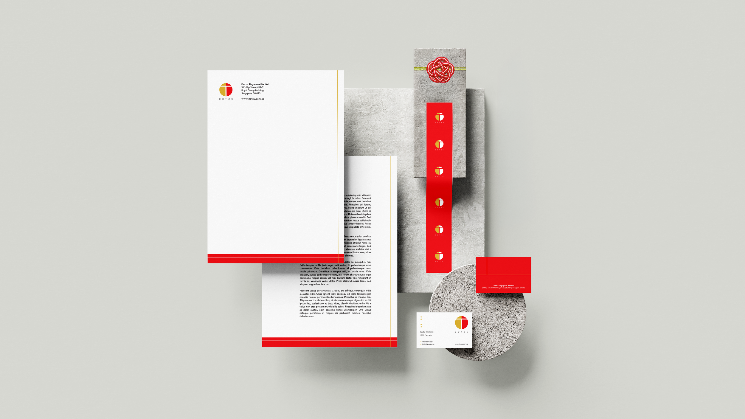
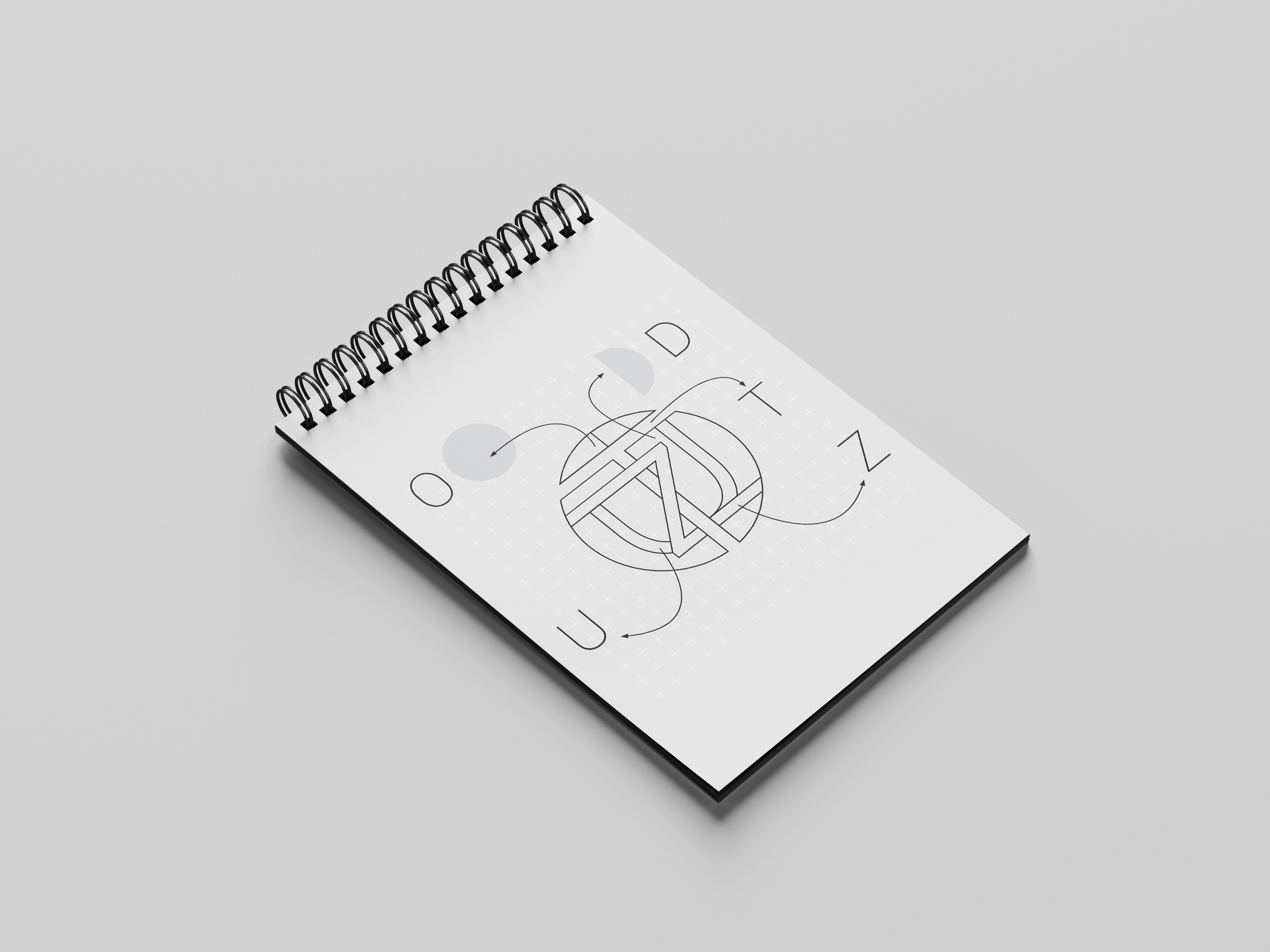
Hidden in Plain Sight
The Interlocking Letters: This represents "Connection." The fact that they are hard to see at first glance mirrors the "discovery" aspect of finding curated, unique products.
The Central 'T': It looks like a literal bridge or a "Torii" gate influence, further strengthening the Japan-to-Singapore link.
Dotzu visual identity is rooted in the concept of synergy and connection. Dotzu logo is created as more than a geometric icon; it is a puzzle where every letter of the brand name—D, O, T, Z, and U—converges to form a singular, balanced 'dot.' This reflects their vision of curation: bringing diverse Japanese treasures together under one roof. The bold split between red and gold symbolizes the handshake between two nations, while the central 'T' acts as the pillar of connection, bridging the distance between Japanese origin and Singaporean destination.
Client
DOTZU
Singapore