
Editorial Design
In the world of editorial design, clarity is king and layout is the crown. My portfolio showcases a diverse range of book design, bespoke menu design, commercial catalogues design, and corporate report design tailored to transform complex information into engaging visual stories.
My process moves beyond aesthetics, I bridge the gap between raw information and intuitive reading experiences. I provide strategic conceptualization, structural pagination, and intentional color palettes to ensure every page serves a purpose–enhancing the content’s flow and making it effortlessly digestible for your audience.
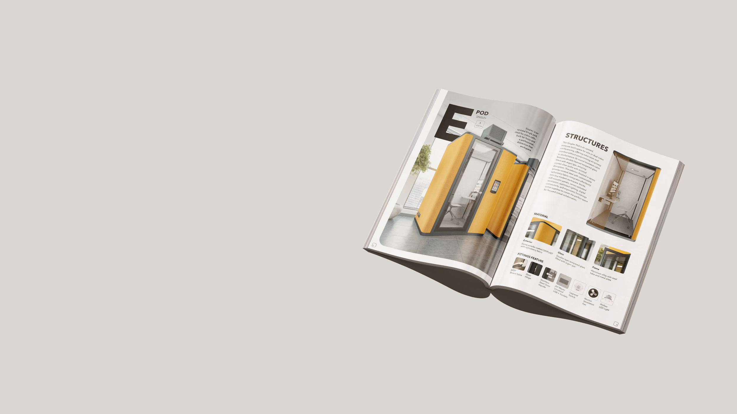
MKS Global Acoustic Pod Catalogue
Product Catalogue Design
Cover Concept Design // Layout Design // Image Editing
I designed the product catalogue for MKS Global’s acoustic pod range with a focus on both logic and visual impact. Rather than just arranging pages, I created a strategic "story" for the reader. I developed the original concept, mapped out the page flow (pagination), and chose every image and layout to ensure the pod’s technical benefits were easy to see at a glance.
By highlighting the most important features and creating an innovative design, I transformed the catalogue into a powerful sales tool. It helps the sales team explain the product clearly and makes it easier for customers to understand why these pods are the best solution for their space.
Client
MKS Global
Mrs Pho Kitchen’s Menu Design
Restaurant Menu Design
Menu Concept Design // Layout Design // Icon Design // Image Editing
A great menu should be more than just a list of dishes—it should be your hardest-working salesperson. I design layouts that balance stunning photography with plenty of "breathing room".
For the Mrs Pho project, I focused on a balanced, grid-based layout that pairs lush, full-bleed photography with clean typography, ensuring the eye travels effortlessly from signature starters to premium mains. To make key information truly "pop," I integrated custom, delicate icons that serve as visual anchors—guiding diners toward house recommendations and dietary preferences without cluttering the aesthetic.
The result is a powerful sales tool that reflects your brand’s soul, high-end look menu that remains perfectly practical, helping your guests decide faster and order with confidence.
Client
Mrs Pho Kitchen Singapore
Milken Institute’s Food and Agriculture in Asia Report Design
Report Design for Official Research
Cover Concept Design // Layout Design // Infographic Design // Data Visualization
The Narrative & Concept
The core concept revolves around the balance between nature, technology, and economic growth. Rather than relying on standard photography for the cover, I developed custom geometric vector artwork representing agricultural landscapes—interweaving farmlands, rivers, crop fields, and renewable energy elements like wind turbines. This modular motif illustrates how interconnected modern food systems are, providing a forward-thinking visual identity that aligns with high-level policy and investment discourse.
Design Highlights & Strengths
Harmonious Visual Identity: A custom color palette grounded in natural greens, teals, and warm earth tones establishes immediate brand cohesion across every spread, cover, and chart.
Integrated Data Visualization: Charts, metrics, and matrices were custom-designed to match the publication’s visual language. Data is presented cleanly through horizontal bar charts, comparative matrices, and radial indicators to make complex numbers instantly scannable.
Consistent Page Architecture: A distinct vertical icon rail on the page margins acts as a visual anchor throughout the report. Coupled with a balanced asymmetric grid, this structure keeps long text readable while maintaining dynamic visual entry points like rounded photo framing and pull quotes.
Accessibility & Scannability: Clear typographic hierarchy ensures that key insights, authors' credentials, and endnotes remain easy to navigate for readers seeking specific information quickly.
Client
Milken Institute Asia Pacific
When designing the publication Food and Agriculture in Asia: Investing in Resilience, Health, and Sustainability for the Milken Institute Asia Pacific, the goal was to transform complex research on agrifood ecosystems, economics, and climate resilience into a visually engaging, accessible, and modern document.
IIMA Alumni Association Singapore’s
Silver Jubilee Commemorative Book Design
Commemorative Book Design
Cover Design // Layout Design // Image Editing
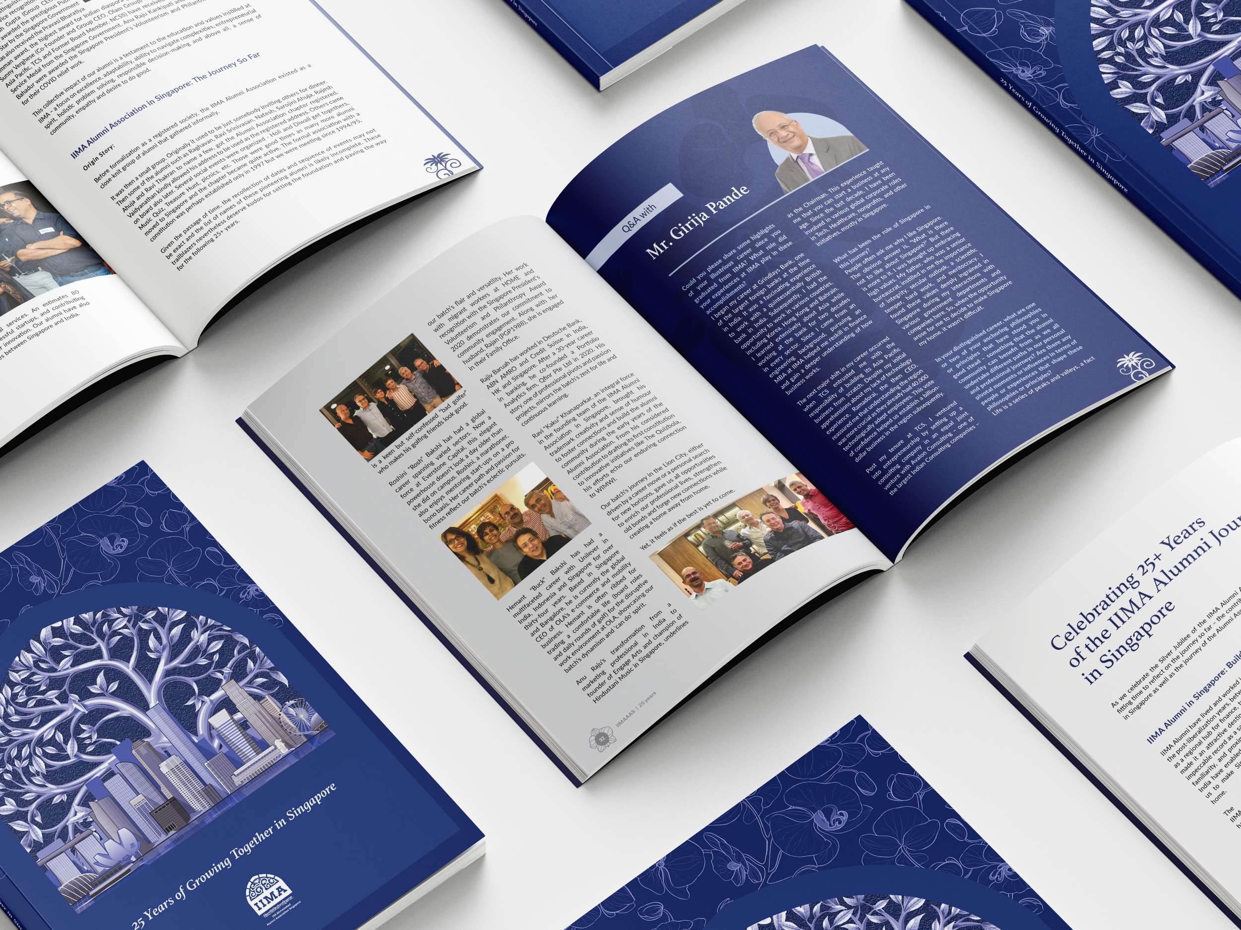
1. The Silver Tree of Life: A Symbol of Growth
At the center of the composition stands the Tree of Life, rendered in a shimmering silver palette to honor the Silver Jubilee (25 years), represent the expansive network of alumni who have branched out into diverse sectors of the Singaporean economy.
2. The Skyline: The Soil of Opportunity
The base of the tree is seamlessly integrated with the Singapore Skyline from which the alumni community has flourished. The transition from the urban landscape into the organic forms of the tree signifies a harmonious relationship between professional ambition and the community’s evolution.
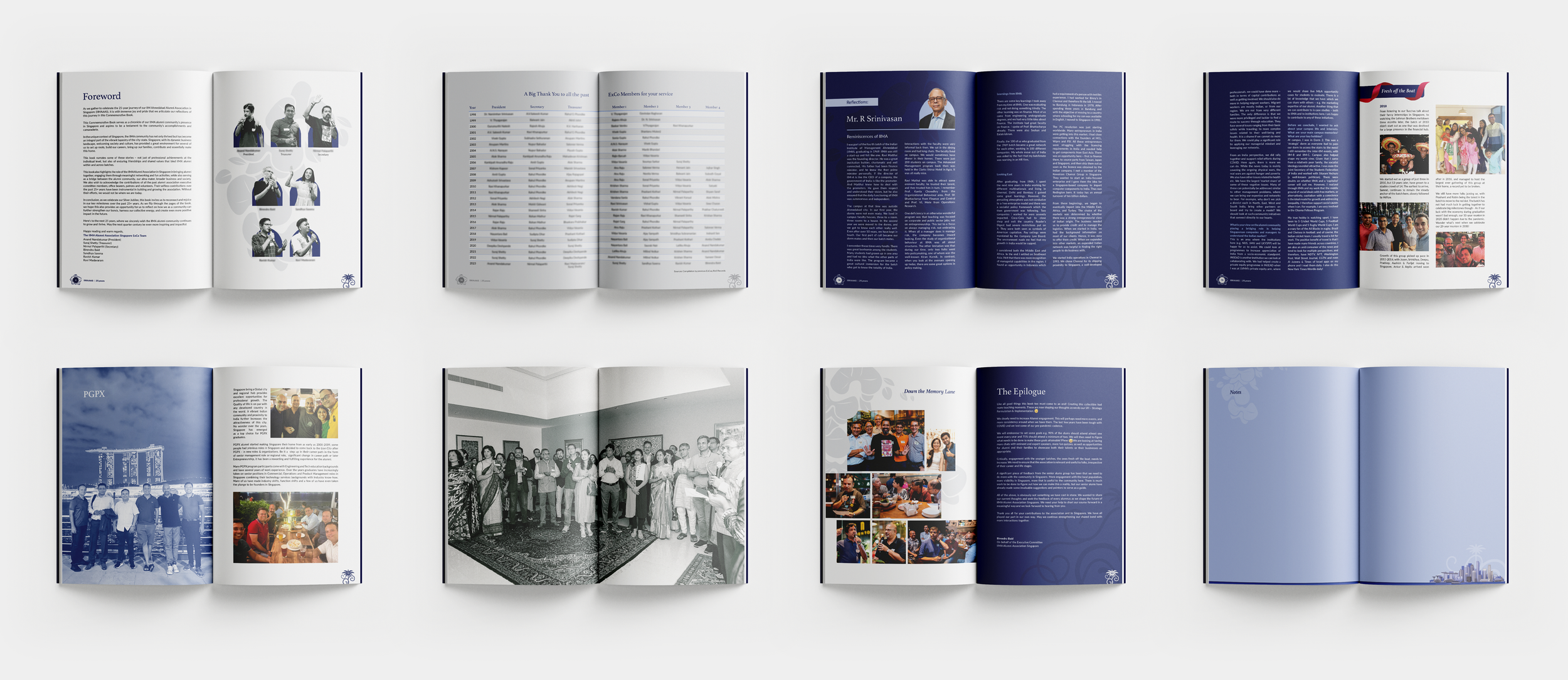
The IIMA Alumni Association Singapore (IIMA-AAS) celebrated its Silver Jubilee with the release of 25 Years of Growing Together in Singapore, a commemorative book that elegantly chronicles the chapter's journey from its modest beginnings to its current status as a powerhouse of leadership. Featuring personal anecdotes and visionary insights from prominent alumni like Piyush Gupta, the volume serves as a "Red Brick" bridge to the Lion City, capturing the unique synergy between IIMA’s academic rigor and Singapore’s economic dynamism.
As the designer, I conceptualized this volume as a visual bridge between IIMA’s iconic heritage and the vibrant energy Singapore . My process was rooted in a strategic approach to pagination, carefully mapping out a 25-year narrative that flows seamlessly from nostalgic beginnings to modern-day triumphs. By meticulously curating specific spreads to highlight the association’s most significant milestones and moments of momentum, I ensured that the layout captures the high-impact nature of the community’s journey.
Every design choice—from the rhythmic balance of white space to the selection of immersive imagery—was intended to transform a historical archive into a living, breathing testament to the collective growth and enduring spirit of IIMA-AAS.
The cover for the IIMA Alumni Association Singapore Silver Jubilee book is a visual tapestry that celebrates a quarter-century of professional brilliance and personal growth within the heart of the Lion City. The design is built upon 4 depth narrations:
3. The Orchid Canopy: A Subtle Embrace
Encompassing the entire composition is a delicate, ethereal canopy of Vanda Miss Joaquim orchids. As the national flower of Singapore, these blooms are ghosted into the deep blue background.
4. The Portal to the Future
The entire scene is framed within a grand archway, reminiscent of the iconic Louis Kahn architecture of the IIMA campus. This serves as a "portal," inviting the viewer to look back through the window of the last 25 years while looking forward to the next chapter.
Client
IIMA Alumni Association Singapore
Wan Sern’s Product Catalogue Design
Catalogue Design
Product Catalogue Design // Cover Design // Layout Design //
Icon Design // Image Editing
The overarching story concept for this catalogue design is centered on "Precision Framed," an approach that directly mirrors Wan Sern’s mastery of glass and aluminium architectural solutions. Rather than simply listing products, the visual narrative treats each page like a well-engineered structure, balancing solid technical elements with open, airy white space. This core philosophy emphasizes structural clarity, effectively communicating to the reader that the brand values both manufacturing precision and modern aesthetic elegance.
The layout strategy masterfully transitions from a dynamic, artistic exterior to a highly organized interior grid system. On the front cover, an asymmetric, overlapping diamond grid acts as a series of literal and metaphorical windows, teasing beautiful architectural photography underneath. Once inside, the layout snaps into a clean, multi-column system with generous margins and whitespace, which prevents the technical data from feeling cluttered and instead elevates the booklet to read like a premium design magazine.
The footer and margin details act as subtle anchors that reinforce the theme of craftsmanship. A razor-thin red horizontal rule runs along the bottom of the pages to politely frame the corporate branding, complemented by vertical text tokens along the outer margins that function like architectural blueprint tabs for easy navigation. Combined with an asymmetric title style and a geometric typographic hierarchy that highlights model numbers instantly, these small details collectively reflect a meticulous attention to detail.
Graphic elements throughout the pages bridge the gap between high-end branding and functional engineering. The signature red rhombus introduced on the cover serves as a recurring visual lens, while the product spreads utilize intuitive visual systems like clean line-art diagrams, directional arrows, and small, color-coded mechanism dots to map out product features seamlessly. These clean infographics transform dense manufacturing specifications into an accessible, user-friendly experience for both contractors and homeowners.
Client
Wan Sern Metal Industries Pte Ltd