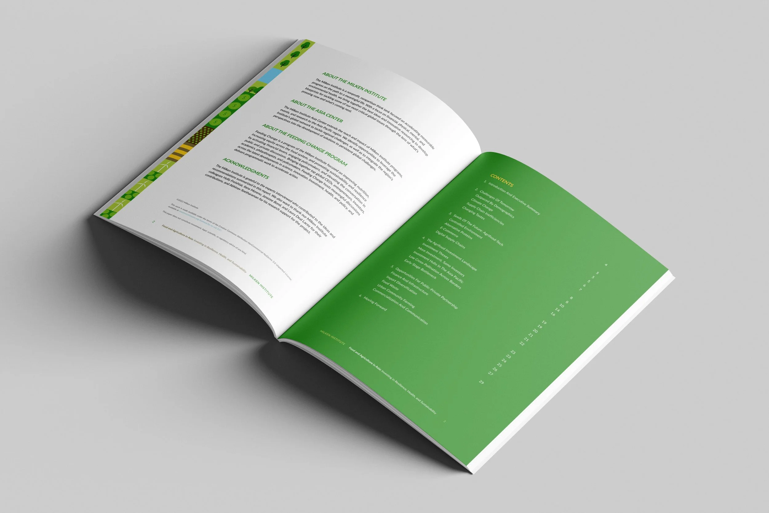
Official Research Report DesignCover Design // Layout Design // Infographic Design // Data Visualization // Image EditingResearch Report Design
Client: Milken Institute Asia Pacific
Title: Food and Agriculture in Asia: Investing in Resilience, Health, and Sustainability
My goal with this design was to move away from typical, dry institutional reports and create a visual identity that is modern, visually engaging, and directly tied to your core themes—finance, agricultural innovation, and sustainability.
Cover Design Concept
Connecting Capital with Agriculture
The Modular "Agri-Landscape" Motif: Rather than using a standard stock photo, I designed a custom, vector-illustrated map grid. It seamlessly weaves together key themes from your report: winding rivers, wind turbines for green energy, farmland, livestock, and subtle dollar-sign crop icons to represent investment capital.
Color Strategy: I curated a vibrant, natural palette dominated by fresh greens, earthy yellows, and water blues, balanced by an energetic accent color for author names. This ensures the report looks fresh and progressive while keeping the overall feel grounded in agriculture.
Clean Typographic Focal Point: The title block sits inside an open, uncluttered section of the illustration. By using a clean, bold sans-serif font, the title remains immediately readable at a glance without clashing with the artwork.
Interior Layout Strategy
Clarity, Consistency, and Flow
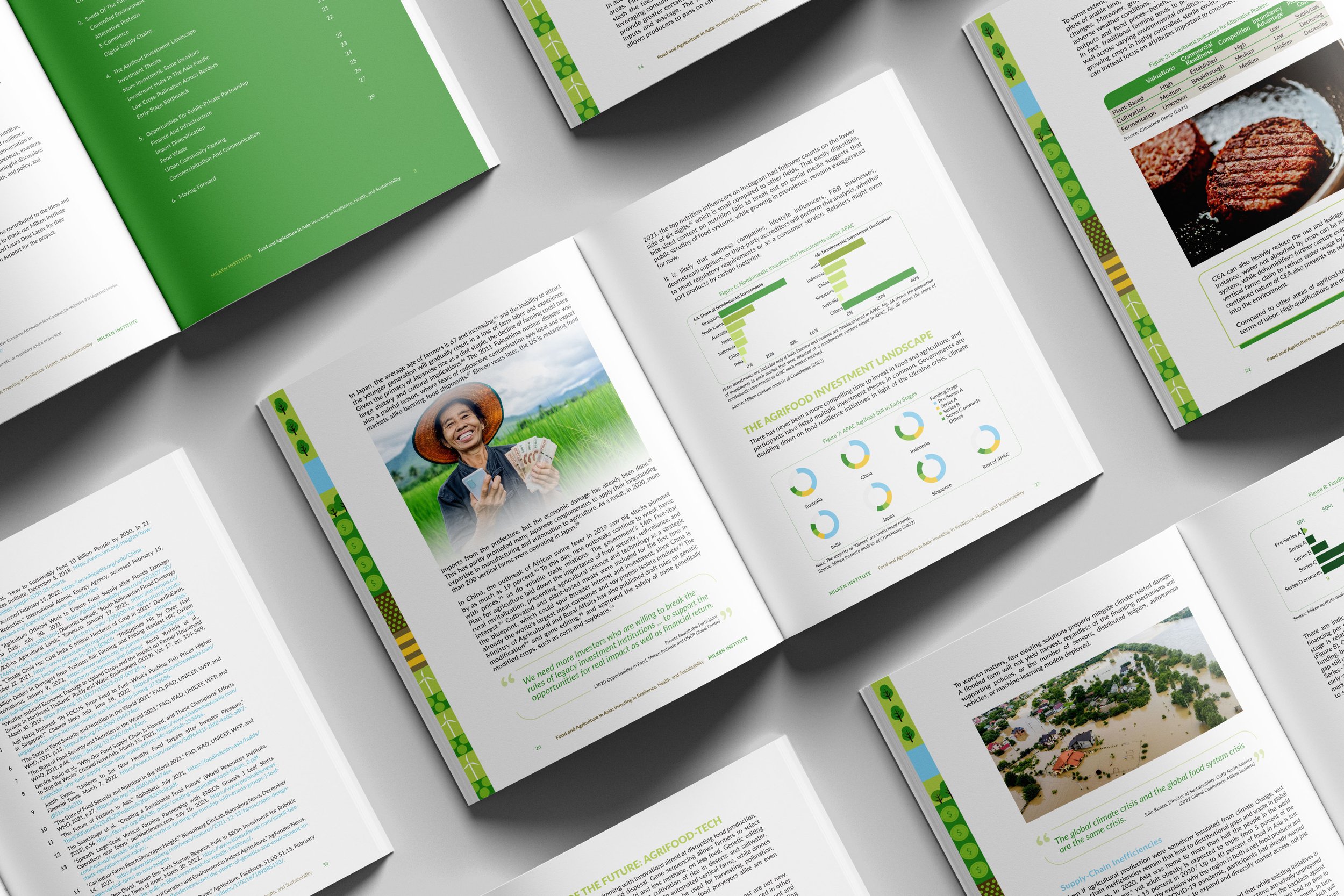
Branded Margin Graphic: To keep the design cohesive from cover to cover, I created a running vertical margin detail along the outer edges. This subtle ribbon carries the cover’s illustration style throughout the entire document, constantly reinforcing your visual brand.
Reader-Friendly Hierarchy: Dense research requires breathing room. I’ve prioritized generous white space, strong section subheadings in your primary brand green, and prominent pull-quotes to break up long text blocks and highlight key insights.
Custom Data Visualization: Charts, scatter plots, and donut graphs are customized to match the publication’s exact color scheme. This makes complex data easy to digest while ensuring all visuals look like a unified family.
Structured Back-Matter: For references and endnotes, I implemented a clean multi-column grid that maximizes page space without compromising legibility.